

My Role:
Product Designer
Teammates:
Chairman + CEO + CTO + 2 Engineers
Duration:
11 months
Joyn is a private communication space that creates meaningful connections and new social experiences, powered by AI.
As the Product Designer, I collaborated closely with the CEO to design the app interface and create user-centered features as we took the product from ideation to the finished product. Following its release on the App Store, we continued to gather user feedback and improve the app to fit user needs through continual upgrades in design and new feature developments.

The problem:
Networking often feels superficial and transactional, with the lack of meaningful interactions as well as the struggle to connect with others on a more authentic level.
Before we started development, the CEO sent me a moodboard with inspiration for how he wanted the app to look and feel. In the beginning, we were actually inspired by Coachella because what better place would resemble an inclusive and creative space than the biggest music festival in California?

Overall, we wanted Joyn to be a social space where people can make genuine connections while staying true to themselves (i.e., without putting up a front like on other popular social apps).
Challenges for me:
Integrating AI features that would feel seamless in the app
Designing a product that would be easy to use and visually appealing for the majority of age groups, while also staying up-to-date with trends in tech
Creating an atmosphere that would give the app a social feel, without the pressure of keeping things too professional
Ideating product features that would keep a balance between privacy and community
We started the project by rigorously beta-testing UX variations to optimize for the app’s intuitiveness. Here’s what our research insights led to:

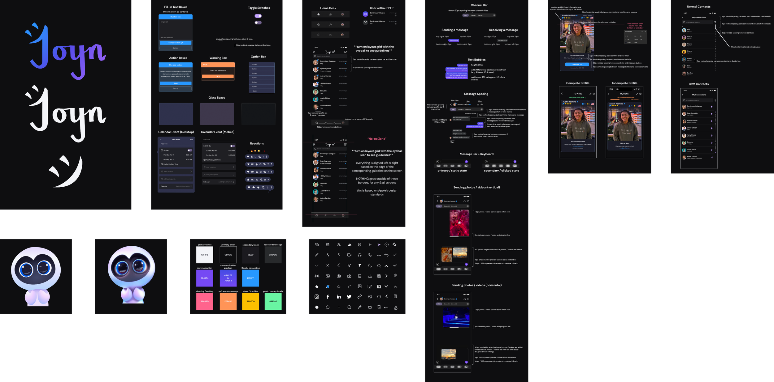
As the sole designer of Joyn, I had the privilege of leading the entire design process for our app, creating its UI across mobile, desktop, and tablet platforms, as well as designing & developing our logo and website. This encompassed a wide array of tasks, from conceptualizing wireframes and user flows to creating more than 400 mockups, ranging from low to high fidelity, and over 100 custom graphics.
The amalgamation of these efforts resulted in the delivery of more than 200 final prototypes, which played a pivotal role in achieving a 58% 28-day retention rate among users.

Collaboration was a cornerstone of my work at Joyn. I closely worked with our CEO asynchronously with a combination of remote and in-person meetings to ideate and implement innovative features, all geared toward providing users with responsive and tailored experiences. This collaboration extended beyond design, as I also contributed insights to product strategy, marketing initiatives, and decision-making processes.
Step 1: Curating a Palette Using Color Psychology
We went through a few color palettes throughout Joyn’s timeline, basing our choices off of research on color psychology.
The initial palette consisted of pink, orange, green, blue, and purple to promote feelings of warmth, creativity, success, and trust, but we realized that five ended up appearing too busy on the interface and assigning things to too many colors would take away from each individual color’s significance and meaning.

Joyn itself as a product would also go through phases where we wanted it to be more informal & social and phases where we wanted it to be more professional, so its appearance followed suit and went through phases where the app had too much color to too little color until we found the perfect medium that balanced being both social and professional.

Step 2: Building the Foundation in Figma
After we decided on the initial palette, I designed the base of the app in chronological order from how it would appear to the user: first the onboarding, then the home screen, and finally the individual messaging screens before moving onto the features. I made sure to follow Apple’s Human Interface Guidelines to create layouts within the proper mobile / desktop / tablet dimensions and constraints.
The following chat features made their way into the final product:
End-to-end encryption
Message channels
Shared calendars & event creation
Snoozing & Archiving
Audio / video calls
AI-generated messages with Cordi
Editing, deleting, & moving messages across channels
Group chats (up to 5 participants)
Auto-translate for global messages
Message reactions


Cordi: Our in-app AI buddy.
Cordi basically “drew itself” with a prompt given to Dall•E2 (left) and we used this version for a while, but its resolution didn’t hold up when we wanted to use it on larger materials so I went in and created Cordi into a slightly simpler, vectorized art by hand (right).


Step 3: Fine-Tuning + Gamifying the Experience

Once we had the chat functions developed, I got to fine-tuning the user profiles. The CEO wanted to gamify the profile creation and connection experience, so I designed the profiles to resemble collectible cards that users can customize with a gallery of their own photos.
We also implemented a point system in which users can collect up to 5 stars by completing their profile and exploring the app to its fullest; once a user has reached certain criteria, they can receive the fifth & final VIP star that shows up as a special icon on their profile.

By gamifying these interactions, users feel more encouraged to maximize their utilization of the app – and the more data the app has, the better outputs the AI can provide for its users.
To get the ball rolling on starting conversations, “Cordi,” our AI, can create matches by using algorithms and AI analysis based on hard data (e.g., age, occupation, mutual connections), calculating compatibility amongst users to filter out the right connections and reduce social noise.
Step 4: My Favorite Part (feat. Cordi)

The latest feature we implemented into our app involves Cordi and the users working together interview-style, and is actually my favorite part of Joyn: the Q&A page!
In this part of the app, users can answer questions generated by Cordi on the spot, and their responses show up in a streamlined social feed where they can view and respond to the questions their connections have answered.
With this feature, users are not only encouraged to reach out to their connections, they are also able to get to know their connections better and truly see them for who they are, not just what they do.
In the early stages, it was quite easy to keep track of designs that were all in a single file because we stayed organized, and there weren’t that many frames to keep track of. However, as we designed more and more features and got closer to taking Joyn to the App Store, despite our best efforts to stay organized in a single file, it was getting difficult to find designs that the development team and I needed when we needed them.
To solve this problem, I was tasked with creating a unified style guide and asset repository which would contain all of our design assets, including over 50 icons, design guidelines, and the official Cordi vector art.
Step 5: Housekeeping
By improving the organization and accessibility of these assets, we streamlined the development process, resulting in a 50% reduction in development time.
When our app was complete, our new priority was on product-led growth. There were 3 components to our growth strategy: product-rooted word of mouth, influencer campaigns, and in-person events.
We created in-app trophy cases for each profile in which users can display nominations (e.g., skill endorsements) from other users and also give them out, which incentivizes deeper engagement and product growth. While we didn’t end up having time to execute the second and third strategies, I suggested the idea of having influencer campaigns, because they provide the fastest exposure to the majority of age groups across platforms as well as content that is relatable and repurposable. We had planned for in-person events as well, as we figured this would have been the best way to hit geographical hotspots and get users to meet their first connections in-person before adding one another on the app.

My chapter with Joyn came to a close as the co-founders realized a difference in vision and the CEO I closely worked with stepped down into a supporting role.
Being a part of the team from ideation to launch, I’ve learned so many invaluable skills from refining my UI & UX knowledge, to learning about the different facets of product, and improving my task management and communication, all of which have helped me grow and will continue to help me grow in my career.
I did my best to make the transition out as smooth as possible with the design guide & asset repository I had created as well for the next designer to utilize, and I am confident that my contributions would be more than enough to help guide the future direction of the app to where it needs to be.
My role as the Product Designer of Joyn was marked by a commitment to holistic design and collaborative innovation, and these efforts significantly contributed to our app's success and user engagement while enhancing our overall design workflow.
One of Joyn’s biggest flaws was that the app felt kind of empty and unwelcoming in the beginning for new users, because unlike other social apps, Joyn doesn’t have an explore page nor a conventional user search function.
This created a discrepancy in having Joyn be both social yet private, because when entering the app for the first time, users go in alone and can’t use it to the fullest without having connections that are already using the app, but they also can’t search for anyone they know if they don’t have their secret phrase.
We tried to solve this by with a couple solutions: revamping our onboarding & sending initial connection invites from the team, but this only serves as a temporary Band-aid that needs to be switched out for another solution in future updates.
What the app could improve on:

Next Up: